Timeline: MARCH 2026 - APR 2026
Type: University Assignment
Contribution: 100%
Scope of Work: Editorial Design,
Book binding, Typography Setting
Timeline: MARCH 2026 - APR 2026
Type: University Assignment
Contribution: 100%
Scope of Work: Editorial Design,
Book binding, Typography Setting
can information
be both beautiful and useful?
can information
be both beautiful and useful?
Cheese and wine pairing is often presented through dense charts and technical guides. I designed and produced Made to Share to reimagine that information as an editorial experience, using visual systems, storytelling, and typography to transform practical knowledge into an engaging publication for both enthusiasts and curious readers.
Cheese and wine pairing is often presented through dense charts and technical guides. I designed and produced Made to Share to reimagine that information as an editorial experience, using visual systems, storytelling, and typography to transform practical knowledge into an engaging publication for both enthusiasts and curious readers.

deliverables
deliverables
I led every stage of the publication’s development, from concept to print. This included organizing the information architecture (research on cheese and wine pairings/traditions, essay writing, etc.), editorial system, typography, and visual hierarchy before overseeing the printing and hand-binding
of the final book.
I led every stage of the publication’s development, from concept to print. This included organizing the information architecture (research on cheese and wine pairings/traditions, essay writing, etc.), editorial system, typography, and visual hierarchy before overseeing the printing and hand-binding
of the final book.


hey, take a look inside!
hey, take a look inside!
To expand the pairing guide and reinforce the focus of the book, I included essays on hosting, gathering, and the social rituals surrounding food.
This shifted the publication from being just a simple guide into a narrative object designed to be explored over time. All the decisions were built around the idea that information should feel accessible and approachable to everyone, from experienced enthusiasts to complete beginners.
I designed the book to be functional and portable, transforming it from a coffee table piece into a publication meant to be carried, explored, and used.
To expand the pairing guide and reinforce the focus of the book, I included essays on hosting, gathering, and the social rituals surrounding food.
This shifted the publication from being just a simple guide into a narrative object designed to be explored over time. All the decisions were built around the idea that information should feel accessible and approachable to everyone, from experienced enthusiasts to complete beginners.
I designed the book to be functional and portable, transforming it from a coffee table piece into a publication meant to be carried, explored, and used.


I developed a visual language inspired by classical paintings, using warm color palettes associated with different wines and cheeses to reinforce the atmosphere of each section. I also designed a gallery-inspired image system that gave photography the same visual importance as the pairing information.
I then built a typographic system that balanced hierarchy with consistency
and refined the layouts across multiple iterations to maintain clarity within a compact format.
I developed a visual language inspired by classical paintings, using warm color palettes associated with different wines and cheeses to reinforce the atmosphere of each section. I also designed a gallery-inspired image system that gave photography the same visual importance as the pairing information.
I then built a typographic system that balanced hierarchy with consistency
and refined the layouts across multiple iterations to maintain clarity within a compact format.
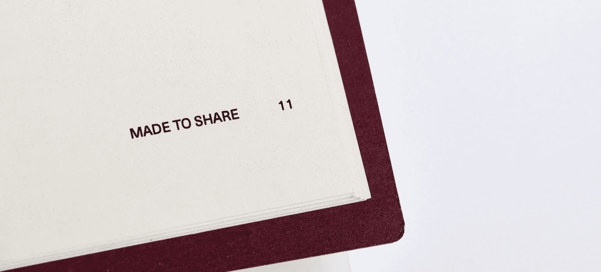
I completed the project by selecting a Penguin-style paperback format with perfect binding, rounded corners, and a protective cover, creating a publication designed to be both durable and enjoyable to use.
I completed the project by selecting a Penguin-style paperback format with perfect binding, rounded corners, and a protective cover, creating a publication designed to be both durable and enjoyable to use.